Aunque hay toneladas de grandes herramientas de visualización en Python, Matplotlib + Seaborn sigue destacando por su capacidad para crear y personalizar todo tipo de gráficos.

Photo by Jack Anstey on Unsplash
En este artículo, repasaré primero algunas secciones para preparar el conocimiento de fondo para algunos lectores que son nuevos en Matplotlib:
- Comprender las dos diferentes interfaces de Matplotlib (¡Esto ha causado mucha confusión!).
- Comprender los elementos de una figura, para que puedan buscar fácilmente las APIs para resolver su problema.
- Echa un vistazo a algunos tipos comunes de gráficos para que los lectores tengan una mejor idea de cuándo/cómo usarlos.
- Aprende a aumentar la "dimensión" de tus gráficos.
- Aprende a hacer una partición de la figura usando GridSpec.
Luego hablaré del proceso de creación de visualizaciones avanzadas con un ejemplo:
- Establecer un objetivo.
- Preparar las variables.
- Preparar la visualización.
Manos a la obra.
Dos interfaces Matplotlib diferentes
Hay dos formas de codificar en Matplotlib. La primera está basada en el estado:
import matplotlib.pyplot as plt
plt.figure()
plt.plot([0, 1], [0, 1],'r--')
plt.xlim([0.0, 1.0])
plt.ylim([0.0, 1.0])
plt.title('Test figure')
plt.show()
Lo cual es bueno para crear gráficos fáciles (se llama un montón de plt.XXX para graficar cada componente en el gráfico), pero no se tiene demasiado control del gráfico. El otro está orientado a objetos:
import matplotlib.pyplot as plt
fig, ax = plt.subplots(figsize=(3,3))
ax.bar(x=['A','B','C'], height=[3.1,7,4.2], color='r')
ax.set_xlabel(xlabel='X title', size=20)
ax.set_ylabel(ylabel='Y title' , color='b', size=20)
plt.show()
Llevará más tiempo programar, pero tendrás el control total de tu figura. La idea es que crees un objeto "figura", que puedes pensar en él como un cuadro delimitador de toda la visualización que vas a construir, y uno o más objetos "ejes", que son los gráficos secundarios de la visualización, (No me preguntes por qué estos gráficos secundarios se llaman "ejes". El nombre es una mierda...) y los gráficos secundarios pueden ser manipulados a través de los métodos de estos objetos "ejes".
(Para explicaciones detalladas de estas dos interfaces, el lector puede consultar
o
Sigamos con el enfoque orientado a los objetos en este tutorial.
Elementos de una figura en la interfaz orientada a objetos
La siguiente figura tomada de https://pbpython.com/effective-matplotlib.html explica bastante bien los componentes de una figura:

Veamos un ejemplo sencillo de cómo crear un gráfico de líneas con una interfaz orientada a objetos.

fig, ax = plt.subplots(figsize=(3,3))
ax.plot(['Alice','Bob','Catherine'], [4,6,3], color='r')
ax.set_xlabel('TITLE 1')
for tick in ax.get_xticklabels():
tick.set_rotation(45)
plt.show()
En los códigos anteriores, creamos un objeto de ejes, creamos un trazado de líneas sobre él, añadimos un título y giramos todas las etiquetas de los x-tick en 45 grados en sentido contrario a las agujas del reloj.
Echa un vistazo a la API oficial para ver cómo manipular los objetos de los ejes: https://matplotlib.org/api/axes_api.html
Algunos tipos comunes de gráficos
Después de tener una idea aproximada de cómo funciona Matplotlib, es hora de revisar algunas de las parcelas más comunes. Son
Gráficos de dispersión (x: Numérico #1, y: Numérico #2),

Gráficas de líneas (x: Categórico - ordinal #1, y: Numérico #1) [Gracias a Michael Arons por señalar un asunto en la figura anterior],

Gráficos de barras (x: Categórico #1, y: Numérico #1). El número 1 es a menudo la cuenta de la categoría 1.

Histograma (x: Numérico #1, y: Numérico #2). La número 1 se combina en grupos (convertida en una variable categórica), y la número 2 suele ser la cuenta de esta variable categórica.

Gráfica de densidad del núcleo (x: Numérico #1, y: Numérico #2). La número 2 es la frecuencia del número 1.

Gráfica de densidad de núcleo en 2-D (x: Numérico #1, y: Numérico #2, color: Numérico #3). La número 3 es la frecuencia conjunta del número 1 y la número 2.

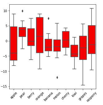
Gráfica de caja (x: Categórica #1, y: Numérica #1, marcas: Numérica #2). La gráfica de caja muestra las estadísticas de cada valor en la Categoría #1, así que nos haremos una idea de la distribución en la otra variable. Valor y: el valor de la otra variable; marcas: muestran cómo se distribuyen estos valores (rango, Q1, mediana, Q3).
Gráfica de violín (x: Categórica #1, y: Numérica #1, Anchura/Marca: Numérica #2). La gráfica del violín es similar a la gráfica de caja, pero muestra mejor la distribución.

Mapa de calor (x: Categórico #1, y: Categórico #2, Color: Numérico #1). El número 1 podría ser el conteo para el categórico 1 y el categórico 2 conjuntamente, o podría ser otros atributos numéricos para cada valor en el par (categórico 1, categórico 2).

Para aprender a graficar estas figuras, los lectores pueden revisar los APIs de seaborn buscando en Google la siguiente lista:
sns.barplot / sns.distplot / sns.lineplot / sns.kdeplot / sns.violinplot / sns.scatterplot / sns.boxplot / sns.heatmap
Te daré dos ejemplos de códigos que muestran cómo se generan los gráficos 2D kde / mapa de calor en la interfaz orientada a objetos.
# 2D kde plots
import numpy as np
import matplotlib.pyplot as plt
import seaborn as snsnp.random.seed(1)
numerical_1 = np.random.randn(100)
np.random.seed(2)
numerical_2 = np.random.randn(100)fig, ax = plt.subplots(figsize=(3,3))
sns.kdeplot(data=numerical_1,
            data2= numerical_2,
            ax=ax,
            shade=True,
            color="blue",
            bw=1)
plt.show()
La clave es el argumento ax=ax. Al ejecutar el método .kdeplot(), seaborn aplicaría los cambios a ax, un objeto 'axes'.
# heat mapimport numpy as np
import pandas as pd
import matplotlib.pyplot as plt
import seaborn as snsdf = pd.DataFrame(dict(categorical_1=['apple', 'banana', 'grapes',
                                      'apple', 'banana', 'grapes',
                                      'apple', 'banana', 'grapes'],
                  categorical_2=['A','A','A','B','B','B','C','C','C'],
                  value=[10,2,5,7,3,15,1,6,8]))
pivot_table = df.pivot("categorical_1", "categorical_2", "value")# try printing out pivot_table to see what it looks like!fig, ax = plt.subplots(figsize=(5,5))sns.heatmap(data=pivot_table,
            cmap=sns.color_palette("Blues"),
            ax=ax)

plt.show()
Aumentar la dimensión de tus gráficos
Para estos gráficos básicos, sólo se puede mostrar una cantidad limitada de información (2-3 variables). ¿Y si quisiéramos mostrar más información en estos gráficos? Aquí hay algunas maneras.
- Gráficas de superposición
Si varios gráficos de líneas comparten las mismas variables x e y, puedes llamar a los gráficos de Seaborn varias veces y graficarlos todos en la misma figura. En el siguiente ejemplo, añadimos una variable categórica más [value = alfa, beta] en el gráfico con gráficos superpuestos.

fig, ax = plt.subplots(figsize=(4,4))
sns.lineplot(x=['A','B','C','D'],
y=[4,2,5,3],
color='r',
ax=ax)
sns.lineplot(x=['A','B','C','D'],
y=[1,6,2,4],
color='b',
ax=ax)
ax.legend(['alpha', 'beta'], facecolor='w')
plt.show()
O podemos combinar un gráfico de barras y uno de líneas con el mismo eje X pero diferente eje Y:

sns.set(style="white", rc={"lines.linewidth": 3})fig, ax1 = plt.subplots(figsize=(4,4))
ax2 = ax1.twinx()sns.barplot(x=['A','B','C','D'],
            y=[100,200,135,98],
            color='#004488',
            ax=ax1)sns.lineplot(x=['A','B','C','D'],
             y=[4,2,5,3],
             color='r',
             marker="o",
             ax=ax2)
plt.show()
sns.set()
Algunos comentarios aquí. Debido a que las dos gráficas tienen un eje y diferente, necesitamos crear otro objeto 'ejes' con el mismo eje x (usando .twinx()) y luego trazar en diferentes 'ejes'. sns.set(...) es para establecer una estética específica para la gráfica actual, y ejecutamos sns.set() al final para volver a establecer todo a los valores por defecto.
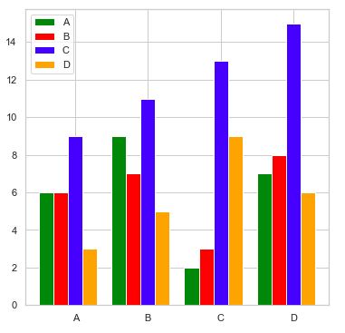
La combinación de diferentes gráficos de barras en un gráfico de barras agrupado también añade una dimensión categórica al gráfico (una variable categórica más).
import matplotlib.pyplot as pltcategorical_1 = ['A', 'B', 'C', 'D']
colors        = ['green', 'red', 'blue', 'orange']
numerical = [[6, 9, 2, 7],
             [6, 7, 3, 8],
             [9, 11, 13, 15],
             [3, 5, 9, 6]]number_groups = len(categorical_1)
bin_width = 1.0/(number_groups+1)fig, ax = plt.subplots(figsize=(6,6))for i in range(number_groups):
    ax.bar(x=np.arange(len(categorical_1)) + i*bin_width,
           height=numerical[i],
           width=bin_width,
           color=colors[i],
           align='center')ax.set_xticks(np.arange(len(categorical_1)) + number_groups/(2*(number_groups+1)))# number_groups/(2*(number_groups+1)): offset of xticklabelax.set_xticklabels(categorical_1)
ax.legend(categorical_1, facecolor='w')plt.show()
En el ejemplo de código anterior, puedes personalizar los nombres de las variables, los colores y el tamaño de las figuras. number_groups y bin_width se calculan en base a los datos de entrada. Luego escribí un ciclo ‘for’ para trazar las barras, un color a la vez, y establecer los ticks y las leyendas al final.
- Facet - mapear el conjunto de datos en múltiples ejes, y que difieren por una o dos variables categóricas. El lector puede encontrar un montón de ejemplos en https://seaborn.pydata.org/generated/seaborn.FacetGrid.html
- Color / Forma / Tamaño de los nodos en un gráfico de dispersión: El siguiente ejemplo de código tomado de la API de Seaborn Scatter Plot muestra cómo funciona. (https://seaborn.pydata.org/generated/seaborn.scatterplot.html)
import seaborn as snstips = sns.load_dataset("tips")
ax = sns.scatterplot(x="total_bill", y="tip",
                     hue="size", size="size",
                     sizes=(20, 200), hue_norm=(0, 7),
                     legend="full", data=tips)
plt.show()
Divide la figura usando GridSpec
Una de las ventajas de la interfaz orientada a objetos es que podemos dividir fácilmente nuestra figura en varios gráficos secundarios y manipular cada uno de ellos con la API de "ejes".

fig = plt.figure(figsize=(7,7))
gs = gridspec.GridSpec(nrows=3,
                       ncols=3,
                       figure=fig,
                       width_ratios= [1, 1, 1],
                       height_ratios=[1, 1, 1],
                       wspace=0.3,
                       hspace=0.3)ax1 = fig.add_subplot(gs[0, 0])
ax1.text(0.5, 0.5, 'ax1: gs[0, 0]', fontsize=12, fontweight="bold", va="center", ha="center")  # adding text to ax1ax2 = fig.add_subplot(gs[0, 1:3])
ax2.text(0.5, 0.5, 'ax2: gs[0, 1:3]', fontsize=12, fontweight="bold", va="center", ha="center")ax3 = fig.add_subplot(gs[1:3, 0:2])
ax3.text(0.5, 0.5, 'ax3: gs[1:3, 0:2]', fontsize=12, fontweight="bold", va="center", ha="center")ax4 = fig.add_subplot(gs[1:3, 2])
ax4.text(0.5, 0.5, 'ax4: gs[1:3, 2]', fontsize=12, fontweight="bold", va="center", ha="center")plt.show()
En el ejemplo, primero dividimos la figura en 3*3 = 9 cajas pequeñas con gridspec.GridSpec(), y luego definimos algunos objetos de ejes. Cada objeto eje podría contener una o más cajas. Digamos que en los códigos anteriores, gs[0, 1:3] = gs[0, 1] + gs[0, 2] se asigna al objeto de ejes ax2. wspace y hspace son parámetros que controlan el espacio entre los gráficos.
Crear visualizaciones avanzadas
Con algunos tutoriales de las secciones anteriores, es hora de producir algunas cosas geniales. Vamos a descargar los datos de las ventas de Analytics Vidhya Black Friday de
df = pd.read_csv('BlackFriday.csv', usecols = ['User_ID', 'Gender', 'Age', 'Purchase'])
df_gp_1 = df[['User_ID', 'Purchase']].groupby('User_ID').agg(np.mean).reset_index()
df_gp_2 = df[['User_ID', 'Gender', 'Age']].groupby('User_ID').agg(max).reset_index()
df_gp = pd.merge(df_gp_1, df_gp_2, on = ['User_ID'])
Entonces obtendrá una tabla de identificación de usuario, sexo, edad y el precio promedio de los artículos en la compra de cada cliente.
Paso 1. Objetivo
Tenemos curiosidad por saber cómo la edad y el sexo afectarían al precio medio de los artículos comprados durante el Viernes Negro, y esperamos ver la distribución del precio también. También queremos saber los porcentajes para cada grupo de edad.
Paso 2. Variables
Nos gustaría incluir en el gráfico el grupo de edad (categórico), el género (categórico), el precio medio de los artículos (numérico) y la distribución del precio medio de los artículos (numérico). Necesitamos incluir otra gráfica con el porcentaje para cada grupo de edad (grupo de edad + recuento/frecuencia).
Para mostrar el precio promedio de un artículo + sus distribuciones, podemos usar la gráfica de la densidad del núcleo, la gráfica de la caja o la gráfica del violín. Entre estos, kde muestra la mejor distribución. Luego hacemos dos o más gráficos de kde en la misma figura y luego hacemos gráficos de facetas, para que la información de grupos de edad y de género pueda ser incluida. Para la otra trama, una trama de barras puede hacer bien el trabajo.
Paso 3. Visualización
Una vez que tengamos un plan sobre las variables, podremos pensar en cómo visualizarlo. Primero tenemos que hacer particiones de figuras, ocultar algunos límites, xticks e yticks, y luego añadir un gráfico de barras a la derecha.
El gráfico de abajo es lo que vamos a crear. De la figura, podemos ver claramente que los hombres tienden a comprar artículos más caros que las mujeres basándose en los datos, y las personas mayores tienden a comprar artículos más caros (la tendencia es más clara para los 4 primeros grupos de edad). También encontramos que las personas de 18 a 45 años son los principales compradores en las ventas del Viernes Negro.

Los códigos que figuran a continuación generan la gráfica (las explicaciones se incluyen en los comentarios):
freq = ((df_gp.Age.value_counts(normalize = True).reset_index().sort_values(by = 'index').Age)*100).tolist()
number_gp = 7


# freq = the percentage for each age group, and there’re 7 age groups.
def ax_settings(ax, var_name, x_min, x_max):
    ax.set_xlim(x_min,x_max)
    ax.set_yticks([])

    ax.spines['left'].set_visible(False)
    ax.spines['right'].set_visible(False)
    ax.spines['top'].set_visible(False)

    ax.spines['bottom'].set_edgecolor('#444444')
    ax.spines['bottom'].set_linewidth(2)

    ax.text(0.02, 0.05, var_name, fontsize=17, fontweight="bold", transform = ax.transAxes)
    return None

# Manipulate each axes object in the left. Try to tune some parameters and you'll know how each command works.
fig = plt.figure(figsize=(12,7))
gs = gridspec.GridSpec(nrows=number_gp,
                       ncols=2,
                       figure=fig,
                       width_ratios= [3, 1],
                       height_ratios= [1]*number_gp,
                       wspace=0.2, hspace=0.05
                      )ax = [None]*(number_gp + 1)
features = ['0-17', '18-25', '26-35', '36-45', '46-50', '51-55', '55+']

# Create a figure, partition the figure into 7*2 boxes, set up an ax array to store axes objects, and create a list of age group names.

for i in range(number_gp):
    ax[i] = fig.add_subplot(gs[i, 0])

    ax_settings(ax[i], 'Age: ' + str(features[i]), -1000, 20000)

    sns.kdeplot(data=df_gp[(df_gp.Gender == 'M') & (df_gp.Age == features[i])].Purchase,
            ax=ax[i], shade=True, color="blue",  bw=300, legend=False)
    sns.kdeplot(data=df_gp[(df_gp.Gender == 'F') & (df_gp.Age == features[i])].Purchase,
            ax=ax[i], shade=True, color="red",  bw=300, legend=False)

    if i < (number_gp - 1):
        ax[i].set_xticks([])

# this 'for loop' is to create a bunch of axes objects, and link them to GridSpec boxes. Then, we manipulate them with sns.kdeplot() and ax_settings() we just defined.
ax[0].legend(['Male', 'Female'], facecolor='w')

# adding legends on the top axes object
ax[number_gp] = fig.add_subplot(gs[:, 1])
ax[number_gp].spines['right'].set_visible(False)
ax[number_gp].spines['top'].set_visible(False)ax[number_gp].barh(features, freq, color='#004c99', height=0.4)
ax[number_gp].set_xlim(0,100)
ax[number_gp].invert_yaxis()
ax[number_gp].text(1.09, -0.04, '(%)', fontsize=10, transform = ax[number_gp].transAxes)
ax[number_gp].tick_params(axis='y', labelsize = 14)

# manipulate the bar plot on the right. Try to comment out some of the commands to see what they actually do to the bar plot.
plt.show()
Las gráficas como esta también se llaman "Joy plot" o "Ridgeline plot". Si intentas usar algunos paquetes de gráficos para dibujar la misma figura, te resultará un poco difícil porque en cada gráfico secundario se incluyen dos gráficos de densidad.
Espero que esta sea una lectura agradable para ustedes.