A complete hands-on guide to the best practices and concepts of visualization in python using matplotlib, pyplot, and seaborn
Business Intelligence, BI is a concept that usually involves the delivery and integration of appropriate and valuable business information in an organization. Companies use BI to detect significant events like gaining insights into customer behavior, monitoring key performance indicators over time and gaining market and sales intelligence to adapt quickly to their changing and dynamic business. Visualization forms the backbone of any BI, hence an analyst or data scientist needs to understand the nuances of visualization and how it plays an important role in communicating insights and findings effectively.
We will lay down some business questions using real-world data and get an understanding of how to create presentations in Python that are powerful, effective and insightful, the PEI framework of visualization.
Here are the five things we will cover in this article:
- Importance of visualization in the analytics industry
- How to decide on which chart to use
- Introduction and background to matplotlib and seaborn in python
- A series of graphs and visualization using python to answer relevant questions from a real-world data
- Best practices of storytelling using visualization
Why data visualization is important?
Data and analytics are changing the basis of competition. Leading companies are using their capabilities not only to improve their core operations but to launch entirely new business models. Topline KPIs (Key Performing Indicators) are becoming the need of the hour with CXOs keeping a constant track of the ever dynamic market thus enabling them to make informed decisions at scale. Dashboards are becoming popular among the stakeholders and with the large influx of data collected over numerous data sources, visualization forms the key to analyzing this data. In short four main reasons to build visuals involve:
- For exploratory data analysis popularly referred to as the data EDA
- Communicate topline findings clearly to different stakeholders
- Share unbiased representation of the data
- Using visualization to support findings, insights, and recommendations
Before we start let us take a look at the fundamentals of charts in visualization. Charts generally fall under two broad categories:
- Data charts, also called quantitative charts, depict numbers graphically to make a point. They include pie charts, bar graphs, stacked bar graphs, scatter plots, line charts, etc.
- Concept charts, also called non-quantitative charts, use words and images. Concept charts describe a situation, such as interaction, interrelationship, leverage or forces at work. Some common examples are process flow charts, gantt charts, matrix, etc.
Data charts are the most widely used chart type in the analytics industry. From dashboards, regular reports to presentations they play an important role in communicating our analysis in a way that stakeholders can understand. Concept chart plays a major role in consulting and strategy outlining, especially in scenarios where stepwise outlining of strategy is important or scenarios that require a SWOT analysis (Strength, Weakness, Opportunities, Threat).
The chart selection framework
While working with platforms like Excel, Python, R, Tableau, R Shiny, Power BI or Qliksense, users are exposed to multiple chart layouts that are attractive and eye-catching. However, in the world of analytics more than creating an attractive visualization, it is important to create a visualization that is effective and impactive. Below is the selection framework the forms the basis of any chart selection.
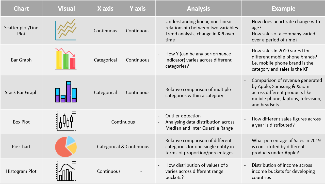
The Chart Selection Framework
Introduction to Data Visualization in Python
Matplotlib History and Architecture
Matplotlib is one of the most widely used data visualization libraries in Python. It was created by John Hunter, who was a neurobiologist and was working on analyzing Electrocorticography signals. His team had access to a licensed version of proprietary software for the analysis and was able to use it in turns only. To avoid this limitation, John developed a MATLAB based version which in the later stages was equipped with a scripting interface for quick and easy generation of graphics, currently known as matplotlib.
Matplotlib operates on a three-layer architecture system, The Backend Layer, Artist Layer & Scripting Layer.
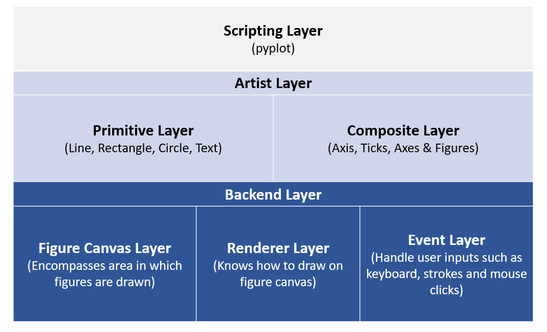
Matplotlib Architecture
Let’s look at the code below:
# — — — — — — — — — — — — - Backend Layer, Figure Canvas Layer: Encompases area in which figures are drawn — — — — — — — — — — — — -
from matplotlib.backends.backend_agg import FigureCanvasAgg as FigureCanvas
#— — — — — — — — — — — — -From Artist layer, importing Artist Figure: Artist layer knows how to use a renderer to draw an object----------------------
from matplotlib.figure import Figure
fig=Figure()
canvas=FigureCanvas(fig) #-----passing object of artist layer to backend layer (Figure Canvas)
#— — — — — — — — — — — — -Using numpy to create random variables----------------------
import numpy as np
x=np.random.rand(100)
#— — — — — — — — — — — — -Plotting a histogram---------------------
ax=fig.add_subplot(111)
ax.hist(x,100)
ax.set_title('Normal Distribution')
fig.savefig('matplotlib_histogram.png')
We can see that to plot a histogram of random numbers using a combination of backend and artist layer, we need to work out multiple lines of the code snippet. To reduce this effort, Matplotlib introduced the scripting layer called Pyplot.
“matplotlib.pyplot” is a collection of command style functions that make matplotlib work like MATLAB. Each pyplot function makes some changes to a figure, e.g., creates a figure, creates a plotting area in a figure, plots some lines in a plotting area, decorates the plot with labels, etc. In matplotlib.pyplot various states are preserved across function calls so that it keeps track of things like the current figure and plotting area, and the plotting functions are directed to the current axes.
import matplotlib.pyplot as plt
#— — — — — — — — — — — — -Using numpy to create random variables----------------------
import numpy as np
x=np.random.rand(100)
plt.hist(x,100) #-----100 refers to the number of bins
plt.title(‘Normal distribution Graph’)
plt.xlabel(‘Random numbers generated’)
plt.ylabel(‘Density’)
plt.show()
The same output can be generated directly through pyplot using fewer lines of code.
Let’s take a look at the example below to understand how we can create different plots using matplotlib and pyplot in python. We will be using the Suicide Rates Overview Data from Kaggle to plot some of the graphs discussed above.
#— — — — — — — — — — — — -Reading dataset — — — — — — — — — — — -
import pandas as pd
suicide_data=pd.read_csv(‘C:/Users/91905/Desktop/master.csv’)
suicide_data.head()
#We can summarize data by multiple columns like country, year, age, #generation etc. For the sake of simplicity we will try and the #answer the following questions
#1. How total suicide number in the globe changed with time
#2. Total suicides by gender and age bucket separately
#3. Total suicides by gender across age buckets
#4. Proportion of suicides by generation
#5. Distribution of suicides till date using box plot and histogram
#— — — — — — — — — — — — -Since data is at different levels, we will try and summarize the data by year, --------------
#— — — — — — — — — — — — -sex, age, sex+age and generation--------------
year_summary=suicide_data.groupby('year').agg(tot_suicide=('suicides_no','sum')).sort_values(by='year',ascending=True)
gender_summary=suicide_data.groupby('sex').agg(tot_suicide=('suicides_no','sum')).sort_values(by='sex',ascending=True)
age_summary=suicide_data.groupby('age').agg(tot_suicide=('suicides_no','sum')).sort_values(by='tot_suicide',ascending=True)
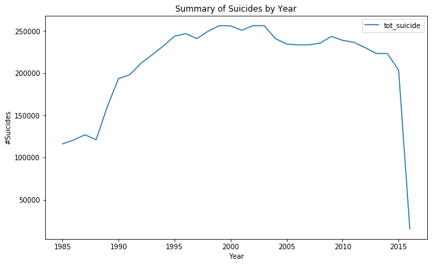
#— — — — — — — — — — — — -Line Graph to see the trend over years-----------------
import matplotlib.pyplot as plt
import numpy as np
%matplotlib inline
year_summary.plot(kind='line', figsize=(10,6));
plt.title('Summary of Suicides by Year');
plt.xlabel('Year');
plt.ylabel('#Suicides');
#— — — — — — — — — — — — -Bar graph to compare suicides by gender and age-------------
gender_summary.plot(kind='bar', figsize=(10,6));
plt.title('Summary of Suicides by Gender');
plt.xlabel('Sex');
plt.ylabel('#Suicides');
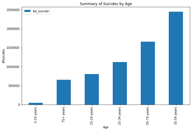
age_summary.plot(kind='bar', figsize=(10,6));
plt.title('Summary of Suicides by Age');
plt.xlabel('Age');
plt.ylabel('#Suicides');
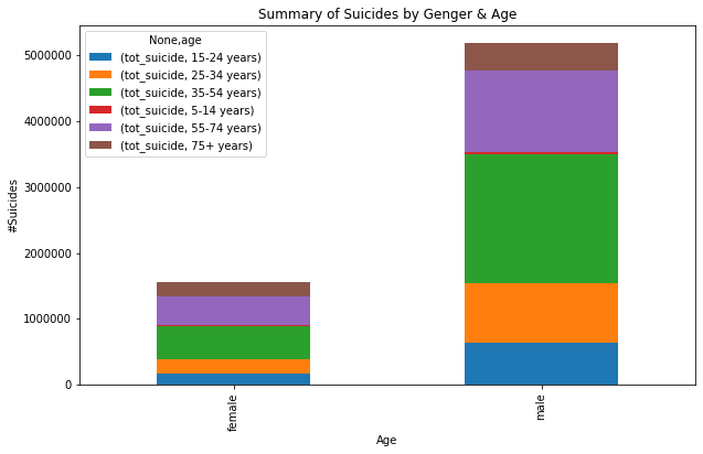
#— — — — — — — — — — — — -Total suicides by age and gender together----
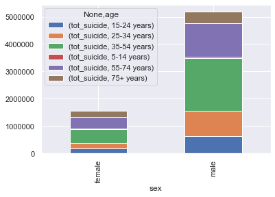
gender_age_summary=suicide_data.groupby(['sex','age']).agg(tot_suicide=('suicides_no','sum')).unstack()
gender_age_summary.head()
gender_age_summary.plot(kind='bar', figsize=(10,6), stacked=True);
plt.title('Summary of Suicides by Genger & Age');
plt.xlabel('Age');
plt.ylabel('#Suicides');
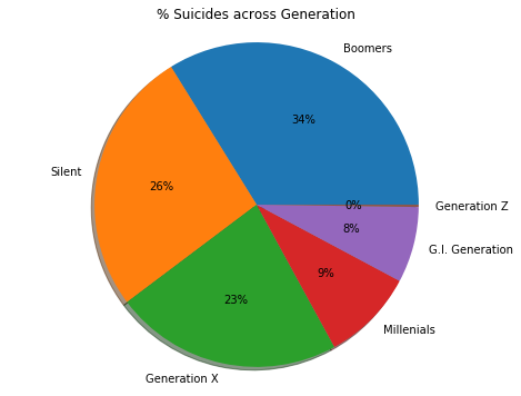
#— — — — — — — — — — — — -Proportion of Suicide by Generation— — — — — — — — — — — — -
generation_summary=suicide_data.groupby('generation').agg(tot_suicide=('suicides_no','sum')).sort_values(by='tot_suicide',ascending=False).reset_index()
generation_summary.head(10)
#— — — — — — — — — — — — -Plotting pie chart— — — — — — — — — — — — -
fig1, ax1 = plt.subplots();
fig1.set_size_inches(8,6)
ax1.pie(generation_summary['tot_suicide'],labels=generation_summary['generation'],autopct='%1.0f%%',shadow=True);
ax1.axis('equal') # Equal aspect ratio ensures that pie is drawn as a circle.
plt.title('% Suicides across Generation')
plt.show();
#— — — — — — — — — — — — -Histogram Plot— — — — — — — — — — — — -
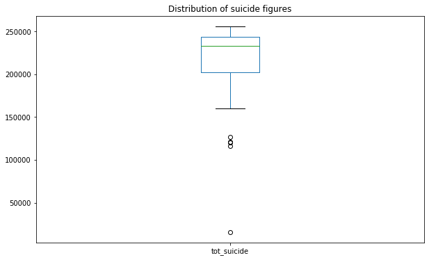
year_summary.plot(kind='box', figsize=(10,6)); #----------To plot histogram change kind='box' to kind='hist'
plt.title('Distribution of suicide figures');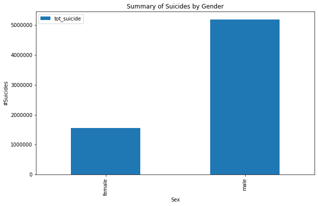
Visualization of Suicide data using Matplotlib and Pyplot
Seaborn
Seaborn is a Python data visualization library based on matplotlib. It provides a high-level interface for drawing attractive and informative statistical graphics. Seaborn usually targets statistical data visualization but provides smarter and enhanced layouts.
Useful tips — use sns.set(color_codes=True) before using the seaborn functionality. This adds a nice background to your visualization.
Let’s try and recreate the above graphs using Seaborn
import seaborn as sns
sns.set(color_codes=True)
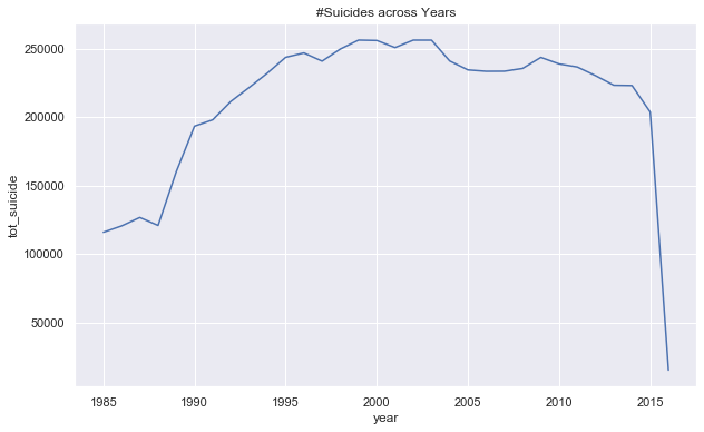
#— — — — — — — — — — — — -Suicides by year--------------------------
year_summary=suicide_data.groupby('year').agg(tot_suicide=('suicides_no','sum')).sort_values \
(by='year',ascending=True).reset_index()
year_summary.head()
#— — — — — — — — — — — — -Using Seaborn to plot trend of suicide with time-------------------------------
fig, ax = plt.subplots(figsize=(10,6));
plt.title('#Suicides across Years')
sns.lineplot(year_summary['year'],year_summary['tot_suicide']);
#— — — — — — — — — — — — -Summary by Gender------------------------------------------
gender_summary=suicide_data.groupby('sex').agg(tot_suicide=('suicides_no','sum')).sort_values(by='sex',ascending=True).reset_index()
fig, ax = plt.subplots(figsize=(10,6));
plt.title('#Suicides across Years')
ax=sns.barplot(gender_summary['sex'],gender_summary['tot_suicide']);
ax.set(xlabel='Gender', ylabel='#Suicides');
plt.show()
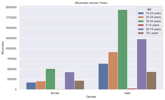
#— — — — — — — — — — — — -Summary by Gender/age------------------------------------------
gender_age_summary=suicide_data.groupby(['sex','age']).agg(tot_suicide=('suicides_no','sum')).reset_index()
gender_age_summary.head()
fig, ax = plt.subplots(figsize=(10,6));
plt.title('#Suicides across Years')
ax=sns.barplot(x=gender_age_summary['sex'],y=gender_age_summary['tot_suicide'],hue=gender_age_summary['age']);
ax.set(xlabel='Gender', ylabel='#Suicides');
plt.show()
gender_age_summary1=suicide_data.groupby(['sex','age']).agg(tot_suicide=('suicides_no','sum')).unstack()
gender_age_summary1.head()
#— — — — — — — — — — — — -Stack bar--------------------------------
sns.set()
gender_age_summary1.plot(kind='bar', stacked=True)
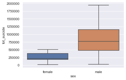
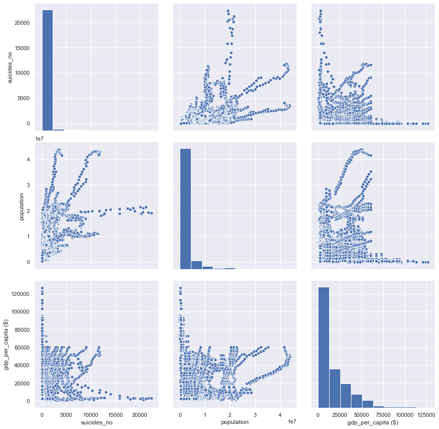
#— — — — — — — — — — — — -Checking correlation between suicide, population and gdp per capita
sns.pairplot(suicide_data[['suicides_no', 'population', 'gdp_per_capita ($)']], size=4, aspect=1);
#— — — — — — — — — — — — -Boxplot— — — — — — — — — — — — -
sns.boxplot(gender_age_summary['sex'],gender_age_summary['tot_suicide']);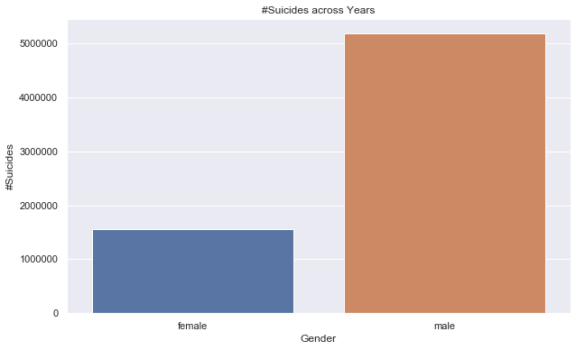
Visualization of Suicide data using Seaborn
Best practices of storytelling using visualization
Here are the few best practices you should follow while creating a presentation or visualization:
- Define the problem statement clearly and use a top-down approach to break it into multiple hypotheses. In the above case study, the problem statement involves understanding the suicide rates across different countries and factors influencing them. So before jumping into a visualization list down all possible factors that might affect suicide rates, e.g. age, gender, GDP, population, growth, generation, etc.
- Identify the key factors that might add value to your story. Think of how the factors can be interconnected to get a bigger picture of what is happening. e.g. instead of looking at suicides by age and gender separately try comparing the suicide rate across both the groups. You can derive quality insights like, Male individuals with age between 18 and 25 have higher suicide rates
- Once you decide on the factors ensure you use the chart selection framework to decide which graph suits the best
- Ensure consistency in formatting across all your graphs which includes color, text size, title size, axis spacing, legend position and alignment of chart objects
- Below every visualization call out a few findings; This will help you stitch together a story for your stakeholder