Build A Web Data Dashboard In Just Minutes With Python
May 15, 202011 minutes read
Exponentially increase power & accessibility by converting your data visualizations into a web-based dashboard with Plotly Dash.
Build a web data dashboard — in just a few lines of Python code
I don’t know about you, but I occasionally find it a little bit intimidating to have to code something. This is doubly so when I’m building something akin to web development rather than doing some local data analysis and visualisation. I’m a competent Python coder, but I wouldn’t call myself a web developer at all, even after having more than dabbled with Django and Flask.
Still, converting your data outputs to a web app leads to a few non-trivial improvements for your project.
It is just much easier to build in true, powerful interactivity into a web app. It also means that you can control exactly how the data is presented, as the web app can become the de facto report as well as the access point to your data. Lastly, and most importantly, you can exponentially scale the accessibility to your outputs; making them available anywhere, any time. There is always a web browser at a user’s fingertips.
So, I bit the bullet and started to do just this with some of my data projects recently, with surprisingly fast speed and efficiency. I converted one of my outputs from this article to a web app here in just a couple of hours.
I thought this was rather cool, and wanted to share how this came together in just a few lines of code.
As always, I include everything you need to replicate my steps (data & code), and the article is not really about basketball. So do not worry if you are unfamiliar with it, and let’s get going.
Before we get started
Data
I include the code and data in my GitLab repo here (dash_simple_nbadirectory). So please feel free to play with it / improve upon it.
Packages
I assume you’re familiar with python. Even if you’re relatively new, this tutorial shouldn’t be too tricky, though.
You’ll need pandas, plotly and dash. Install each (in your virtual environment) with a simple pip install [PACKAGE_NAME].
Previously, on Python…
For this tutorial, I am simply going to skip *most* of the steps taken to create the local version of our visualisation. If you’re interested in what is going on, take a look at this article:
Create effective data visualizations of proportionsBest ways to see individual contributions to a whole and changes over time, at various dataset sizes — (incl…towardsdatascience.com
We will have a recap session, though, so you can see what is happening between plotting the chart locally with Plotly, and how to port that to a web app with Plotly Dash.
Load data
I have pre-processed the data, and saved it as a CSV file. It is a collection of player data for the current NBA season (as of 26/Feb/2020), which shows:
What share of their team’s shots they are taking, and
How efficient / effective they are at doing it.
For this portion, follow along by opening local_plot.py in my repo.
Inspect the data with all_teams_df.head(), and you should see:
Each player’s data has been compiled for each minute of the game (excluding overtime), with stats pl_acc and pl_pps being the only exception, as they have been compiled per quarter of the game (for each 12 minute period).
The dataframe contains all NBA players, so let’s break it down to a manageable size, by filtering for a team. For instance, the New Orleans Pelicans’ players can be chosen with:
all_teams_df[all_teams_df.group == 'NOP']
Then, our data can be visualised in Plotly, as below:
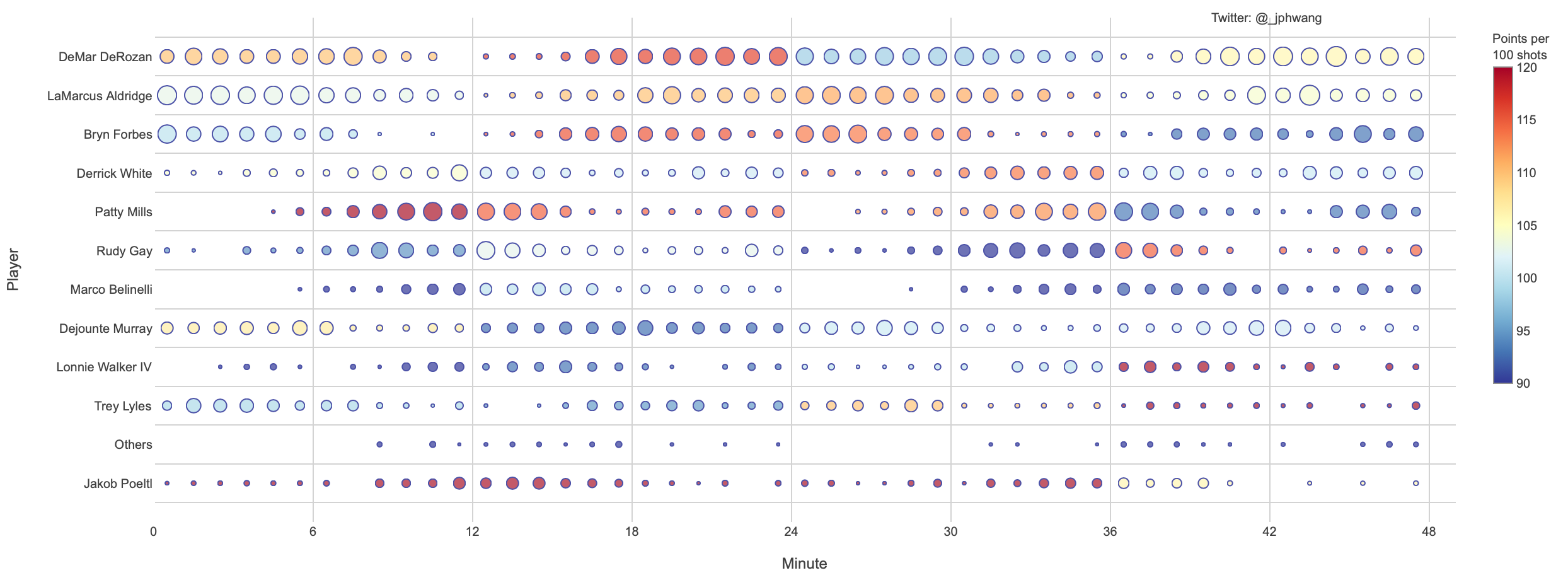
I do add a few small details to my chart, to produce this version of the same graph.
Same chart, with a few ‘small details’ added (& different team).
This is the code that I used to do it.
Now, while it’s a lot of formatting code, I thought it useful to show you how I did it, because we are going to be re-using these functions in our Dash version of the code.
Now, let’s get to the main event — how to create a web app out of these plots.
Into the World Wide Web
You can read more about Plotly Dash here, but for now all you need to know that it is an open-source software package developed to abstract away the difficulties in putting your visualisations on the web.
It works with Flask under the hood, and you can happily reuse most of the code that you used to develop plots in plotly.py.
This is the simple version that I put together:
import pandas as pd
import dash
import dash_core_components as dcc
import dash_html_components as html
from dash.dependencies import Input, Output

all_teams_df = pd.read_csv('srcdata/shot_dist_compiled_data_2019_20.csv')

app = dash.Dash(__name__)
server = app.server
team_names = all_teams_df.group.unique()
team_names.sort()
app.layout = html.Div([
    html.Div([dcc.Dropdown(id='group-select', options=[{'label': i, 'value': i} for i in team_names],
                           value='TOR', style={'width': '140px'})]),
    dcc.Graph('shot-dist-graph', config={'displayModeBar': False})])

@app.callback(
    Output('shot-dist-graph', 'figure'),
    [Input('group-select', 'value')]
)
def update_graph(grpname):
    import plotly.express as px
    return px.scatter(all_teams_df[all_teams_df.group == grpname], x='min_mid', y='player', size='shots_freq', color='pl_pps')

if __name__ == '__main__':
    app.run_server(debug=False)
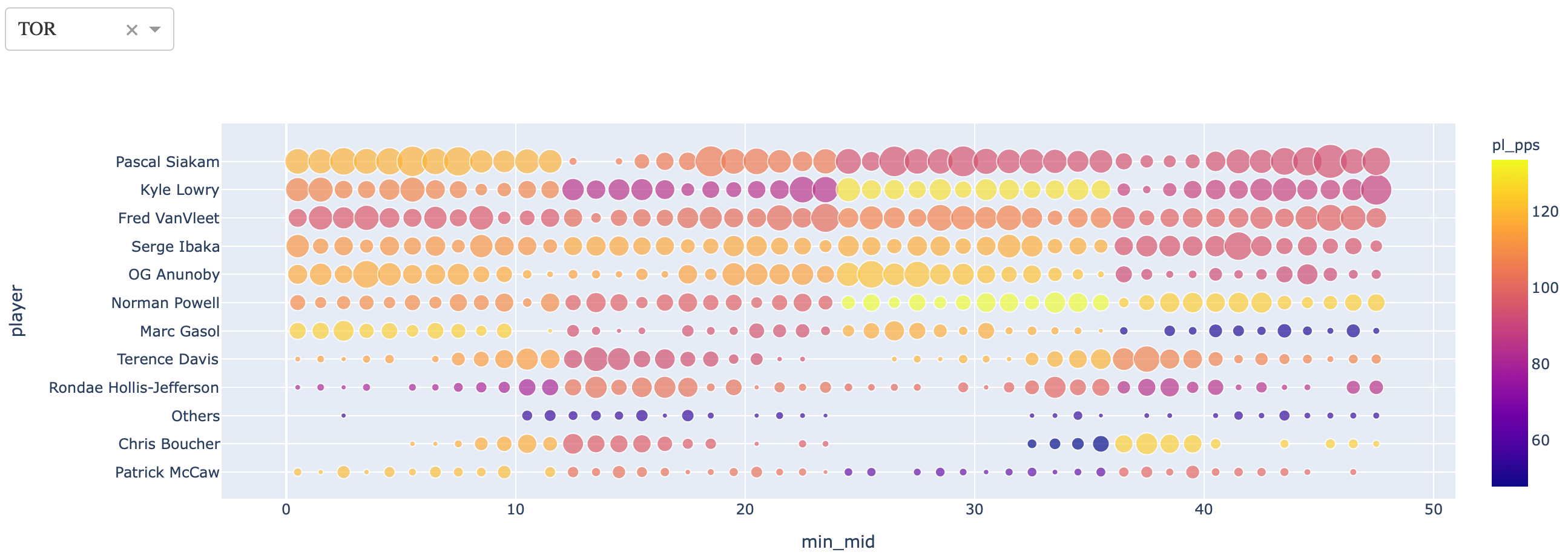
Try it out! It should open this plot on your browser.
Our first Dash app!
What’s the big deal? Well, for one — it is a live web app, in under 25 lines of code. And notice the drop-down menu on the top left? Try changing the values on it, and watch the graph change *magically*.
Go on, I’ll wait.
Okay? Done.
Let’s briefly go through the code.
At a high level, what I’m doing here is to:
Initialise a Dash app;
Get a list of available team names, and provide it to a dropdown menu (with DOM id group-select) with a default value or ‘TOR’;
Instantiate a Graph object as the shot-dist-graph identifier within Dash; and
Create a callback function where if any of the values are changed, it will call the update_graph function and pass the returned object to the Output.
If you take a look at the code, so many of what is probably trivial for web devs but annoying for me is abstracted away.
dcc.Graph wraps the figure object from plotly.py into my web app and HTML components like divs can be called and set up conveniently with html.Div objects.
Most gratifying for me personally is that Input objects and callbacks from those inputs are declaratively set up, and I can avoid having to deal with things like HTML forms or JavaScript.
And the resulting app still works beautifully. The graph is updated the moment that the pulldown menu is used to select another value.
And we did all that in fewer than 25 lines of code.
Why Dash?
At this point, you might be asking — why Dash? We can do all this with a JS framework front end, and Flask, or any one of myriad other combinations.
To someone like me who prefers the comfort of Python than natively dealing with HTML and CSS, using Dash abstracts away a lot of stuff that doesn’t add a lot of value to the end product.
Take, for instance, a version of this app that includes further formatting and notes for the audience:
(It is simple_dash_w_format.py in the git repo)
def clean_chart_format(fig):
    fig.update_layout(
        paper_bgcolor="white",
        plot_bgcolor="white",
        annotations=[
            go.layout.Annotation(
                x=0.9,
                y=1.02,
                showarrow=False,
                text="Twitter: @_jphwang",
                xref="paper",
                yref="paper",
                textangle=0
            ),
        ],
        font=dict(
            family="Arial, Tahoma, Helvetica",
            size=10,
            color="#404040"
        ),
        margin=dict(
            t=20
        )
    )
    fig.update_traces(marker=dict(line=dict(width=1, color='Navy')),
                      selector=dict(mode='markers'))
    fig.update_coloraxes(
        colorbar=dict(
            thicknessmode="pixels", thickness=15,
            outlinewidth=1,
            outlinecolor='#909090',
            lenmode="pixels", len=300,
            yanchor="top",
            y=1,
        ))
    fig.update_yaxes(showgrid=True, gridwidth=1, tickson='boundaries', gridcolor='LightGray', fixedrange=True)
    fig.update_xaxes(showgrid=True, gridwidth=1, gridcolor='LightGray', fixedrange=True)
    return True


def make_shot_dist_chart(input_df, color_continuous_scale=None, size_col='shots_count', col_col='pl_acc', range_color=None):
    max_bubble_size = 15
    if color_continuous_scale is None:
        color_continuous_scale = px.colors.diverging.RdYlBu_r
    if range_color is None:
        range_color = [min(input_df[col_col]), max(input_df[col_col])]

    fig = px.scatter(
        input_df, x='min_mid', y='player', size=size_col,
        color=col_col,
        color_continuous_scale=color_continuous_scale,
        range_color=range_color,
        range_x=[0, 49],
        range_y=[-1, len(input_df.player.unique())],
        hover_name='player', hover_data=['min_start', 'min_end', 'shots_count', 'shots_made', 'shots_freq', 'shots_acc', ],
        render_mode='svg'
    )
    fig.update_coloraxes(colorbar=dict(title='Points per<BR>100 shots'))
    fig.update_traces(marker=dict(sizeref=2. * 30 / (max_bubble_size ** 2)))
    fig.update_yaxes(title="Player")
    fig.update_xaxes(title='Minute', tickvals=list(range(0, 54, 6)))

    return fig


app.title = 'Dash Demo - NBA'
team_names = all_teams_df.group.unique()
team_names.sort()
app.layout = html.Div([
    html.Div([
        dcc.Markdown(
            """
            #### Shot Frequencies & Efficiencies (2019-20 NBA Season)

            This page compares players based on shot *frequency* and *efficiency*,
            divided up into minutes of regulation time for each team.

            Use the pulldown to select a team, or select 'Leaders' to see leaders from each team.


            *Notes*:

            * **Frequency**: A team's shots a player is taking, indicated by **size**.

            * **Efficiency**: Points scored per 100 shots, indicated by **colour** (red == better, blue == worse).

            * Players with <1% of team shots are shown under 'Others'
            """
        ),
        html.P([html.Small("See more data / NBA analytics content, find me on "), html.A(html.Small("twitter"), href="https://twitter.com/_jphwang", title="twitter"), html.Small("!")]),
    ]),
    html.Div([
        dcc.Dropdown(
            id='group-select',
            options=[{'label': i, 'value': i} for i in team_names],
            value='TOR',
            style={'width': '140px'}
        )
    ]),
    dcc.Graph(
        'shot-dist-graph',
        config={'displayModeBar': False}
    )
])


@app.callback(
    Output('shot-dist-graph', 'figure'),
    [Input('group-select', 'value')]
)
def update_graph(grpname):
    fig = make_shot_dist_chart(
        all_teams_df[all_teams_df.group == grpname], col_col='pl_pps', range_color=[90, 120], size_col='shots_freq')
    clean_chart_format(fig)
    if len(grpname) > 3:
        fig.update_layout(height=850, width=1250)
    else:
        fig.update_layout(height=500, width=1250)

    return fig
Most of the changes are cosmetic, but I will note that here, I just write the body text in Markdown, and simply carry over my formatting functions from Plotly to be used in the formatting the graphs in Dash.
This saves me a tremendous amount of time between doing data analysis and visualisation to deployment to clients’ views.
All in all, from starting with my initial graph, I think it probably took less than an hour to deploy it to Heroku. Which is pretty amazing.
I will get into more advanced features of Dash, and actually doing some cool things with it functionality-wise, but I was very happy with this outcome in terms of ease and speed.
Try it out yourself — I think that you’d be very impressed. Next time, I plan to write about some really cool things you can do with Dash, and building truly interactive dashboards.
If you liked this, say 👋 / follow on twitter, or follow for updates. This is the article that the data viz is based on:
IntroductionJupyter Notebook is a great programming environment and often the most popular choice for data scientists or data analysts that are coding in python. Unfortunately, its default settings do not allow the level of customization that you have with standard programming environments such as PyCharm or similar tools.Jupyter Notebooks themes are trying to diminish this gap and allow you to make the notebook a bit prettier and also more functional using the themes. In this article, I will walk you through the installation process of Jupyter Notebook themes and show you some of their most important features.InstallationJupyter Notebook themes is an open-source library and can be installed with pip install. Just type the following code in a command line:pip install jupyterthemesThis should trigger the installation of the latest version. Once done you should be able to switch between themes, adjust fonts used in the notebooks, or customize the style of the plots. We will go through these features in detail in the next sections.Changing themesAfter installation, you can launch Jupyter Notebooks as normal and inspect the themes from within the notebook itself.In order to list all possible themes, you can use the following code:!jt -lAs you can see there are currently nine themes available. In order to switch themes you can use this command:!jt -t <theme_name>Let’s choose onedork theme.!jt -t onedorkYou will see that the theme does not change immediately. Some people report that they can reload the page and see the effect after that. From my personal experience, I have to restart Jupyter Notebook in order for the theme to change. Just stop the notebook and launch it again. This is how it should look like with onedork theme when it is loaded.Now, you can play with different themes and choose your favorite one.What you will notice is that some parts of the standard GUI are not visible by default in the theme settings. I am referring to the part pictured below.In order to switch the theme but keeping the standard GUI look, you could use the following variation of the code.!jt -t <theme_name> -T -N -klWith onedork theme, these would like that.!jt -t onedork -T -N -klRestarting Jupyter Notebooks should give you the result similar to the screenshot below.In order to restore the notebook to its default settings, you can use this code.!jt -rNote that I have shown the commands being executed in the Jupyter notebook itself but you can use them without the exclamation mark in the terminal window as well.Setting up the graphing styleOnce you are using the themes you will notice that the graphs created with Matplotlib library do not look the best. For example, this is a simple code to create a line chart.import matplotlib.pyplot as plt
%matplotlib inline
bp_x = np.linspace(0, 2*np.pi, num=40, endpoint=True)
bp_y = np.sin(bp_x)
# Make the plot
plt.plot(bp_x, bp_y, linewidth=3, linestyle="--",
color="blue", label=r"Legend label $\sin(x)$")
plt.xlabel(r"Description of $x$ coordinate (units)")
plt.ylabel(r"Description of $y$ coordinate (units)")
plt.title(r"Title here (remove for papers)")
plt.xlim(0, 2*np.pi)
plt.ylim(-1.1, 1.1)
plt.legend(loc="lower left")
plt.show()And this is the screenshot of the plot that is created in the notebook as seen using the onedork theme without customization.This definitely does not match the theme you have chosen. It turns out that in order to customize Matplotlib to match the theme you will need to add two additional lines of code at the top of your notebook.from jupyterthemes import jtplot
jtplot.style()Once you run the same chart code (with the two code lines from above added at the top of the notebook) you should see that the chart now matches the current style of the theme.That looks much better!You can actually change the graph style to match any theme that you want.from jupyterthemes import jtplot
jtplot.style(<theme_name>)If you do not give a parameter theme for the style function it will use the theme that is currently loaded in the notebook.Note unlike with theme setting there is no need to restart the notebook by changing the Matplotlib graphing style.Changing fontsJupyter Notebook themes do not only allow you to change themes but also do some additional customization regarding the fonts being used in the notebook.You can change the fonts when loading a theme with jt command and adding some additional parameters. You can customize…font used for code (-f) and its size (-fs),font used for notebook (-nf) and its size (-nfs) ,font used for text/markdown (-ft) and its size (-fts).SummaryIn this article, you have learned how to customize your standard Jupyter Notebook with Jupyter Notebook themes. We went through the details of the installation of the library and set up the themes including graph and font customization.You should be able to try it yourself now.Happy customizing!Originally published at aboutdatablog.com: Customize your Jupyter Notebooks with Jupyter Notebooks Themes, on January 20, 2021.
OPINION.You have probably read an article about the difference between a data scientist and a data engineer. I always thought the distinction was clear. Data engineers make the data ready for use and then data scientists work on that data.However, my opinion on this distinction has changed dramatically after I started working as a data scientist.Photo by Ben White on UnsplashYou have probably read an article about the difference between a data scientist and a data engineer. I always thought the distinction was clear. Data engineers make the data ready for use and then data scientists work on that data.Everything in data science starts with data. Your machine learning model is just as good as the data fed into it. Garbage in, garbage out! A data scientist cannot do some magic to create a valuable product without proper data.The proper data is not always readily available for data scientists. In most cases, it will the responsibility of the data scientist to convert the raw data to a proper format.Unless you work for a big tech company that has separate teams of data engineers and data scientists, you should possess the ability and skills to handle some data engineering tasks. These tasks cover a broad range of operations and I will elaborate on this in the remaining part of the article.What is the difference anyway?I would like to state my opinion on the relationship between the job of a data engineer and a data scientist.A data engineer is a data engineer. A data scientist should be both a data scientist and a data engineer.It may seem like an arguable statement. However, I would like to emphasize that my opinion was different before I started working as a data scientist. I used to think of data engineers and data scientists as separate entities.In the remaining part of the article, I will try to explain what I mean by a data scientist should be both a data scientist and a data engineer.For instance, data engineers do a set of operations known as ETL (extract, transform, load). It covers the procedures for collecting data from one or more sources, apply some transformations, and then load into a different source.I would definitely not be surprised if a data scientist is expected to perform ETL operations. Data science is still evolving and most companies do not have clearly separated data engineer and data scientist roles. As a result, a data scientist should be able to perform some data engineering tasks.If you expect to only work on running machine learning algorithms with ready-to-use data, you will face the harsh truth soon after you start working as a data scientist.You may have to write some stored procedures in SQL to preprocess the client data. It is also possible that you receive the client data from a few different sources. It will be your job to extract and combine them. Then, you will need to load them into a single source. In order to write efficient stored procedures, you need extensive SQL skills.The transform part of ETL procedures involves in many data cleaning and manipulation steps. SQL may not be the best choice if you work with large-scale data. Distributed computing is a better alternative in such cases. Therefore, a data scientist should also be familiar with distributed computing.Your best friend in distributed computing might be Spark. It is an analytics engine used for large-scale data processing. We can distribute both data and computations over clusters to achieve a substantial performance increase.If you are familiar with Python and SQL, you won’t have hard time getting used to Spark. You can use Spark features with PySpark which is a Python API for Spark.Read also: A Beginner’s Guide to Apache SparkWhen it comes to work with clusters, the optimal environment is the cloud. There are various cloud providers but AWS, Azure, and Google Cloud Platform (GCP) lead the way.Although the PySpark code is the same for all cloud providers, how you setup the environment and create clusters change between them. They allow for creating clusters using both scripts or the user interface.Distributed computing over clusters is a whole different world. It is nothing like doing analysis in your computer. It has very different dynamics. Evaluating cluster performance and choosing the optimal number of workers for a cluster will be your predominant concerns.Read also:* The Full Stack Data Scientist* Everything a Data Scientist Should Know About Data Management
Time series data consists of data points attached to sequential time stamps. Daily sales, hourly temperature values, and second-level measurements in a chemical process are some examples of time series data.Time series data has different characteristics than ordinary tabular data. Thus, time series analysis has its own dynamics and can be considered as a separate field. There are books over 500 pages to cover time series analysis concepts and techniques in depth.Pandas was created by Wes Mckinney to provide an efficient and flexible tool to work with financial data which is kind of a time series. In this article, we will go over 4 Pandas functions that can be used for time series analysis.We need data for the examples. Let’s start with creating our own time series data.import numpy as np
import pandas as pd
df = pd.DataFrame({
"date": pd.date_range(start="2020-05-01", periods=100, freq="D"),
"temperature": np.random.randint(18, 30, size=100) +
np.random.random(100).round(1)
})
df.head()(image by author)We have created a data frame that contains temperature measurements during a period of 100 days. The date_range function of Pandas can be used for generating a date range with customized frequency. The temperature values are generated randomly using Numpy functions.We can now start on the functions.1. ShiftIt is a common operation to shift time series data. We may need to make a comparison between lagged or lead features. In our data frame, we can create a new feature that contains the temperature of the previous day.df["temperature_lag_1"] = df["temperature"].shift(1)
df.head()(image by author)The scalar value passed to the shift function indicates the number of periods to shift. The first row of the new column is filled with NaN because there is no previous value for the first row.The fill_value parameter can be used for filling the missing values with a scalar. Let’s replace the NaN with the average value of the temperature column.df["temperature_lag_1"] = df["temperature"]\
.shift(1, fill_value = df.temperature.mean())
df.head()(image by author)If you are interested in the future values, you can shift backwards by passing negative values to the shift function. For instance, “-1” brings the temperature in the next day.2. ResampleAnother common operation performed on time series data is resampling. It involves in changing the frequency of the periods. For instance, we may be interested in the weekly temperature data rather than daily measurements.The resample function creates groups (or bins) of a specified internal. Then, we can apply aggregation functions to the groups to calculate the value based on resampled frequency.Let’s calculate the average weekly temperatures. The first step is to resample the data to week level. Then, we will apply the mean function to calculate the average.df_weekly = df.resample("W", on="date").mean()
df_weekly.head()(image by author)The first parameter specifies the frequency for resampling. “W” stands for week, surprisingly. If the data frame does not have a datetime index, the column that contains the date or time related information needs to be passed to the on parameter.3. AsfreqThe asfreq function provides a different technique for resampling. It returns the value at the end of the specified interval. For instance, asfreq(“W”)returns the value on the last day of each week.In order to use the asfreq function, we should set the date column as the index of the data frame.df.set_index("date").asfreq("W").head()(image by author)Since we are getting a value at a specific day, it is not necessary to apply an aggregation function.4. RollingThe rolling function can be used for calculating moving average which is a highly common operation for time series data. It creates a window of a particular size. Then, we can use this window to make calculations as it rolls through the data points.The figure below explains the concept of rolling.(image by author)Let’s create a rolling window of 3 and use it to calculate the moving average.df.set_index("date").rolling(3).mean().head()(image by author)For any day, the values show the average of the day and the previous 2 days. The values of the first 3 days are 18.9, 23.8, and 19.9. Thus, the moving average on the third day is the average of these values which is 20.7.The first 2 values are NaN because they do not have previous 2 values. We can also use this rolling window to cover the previous and next day for any given day. It can be done by setting the center parameter as true.df.set_index("date").rolling(3, center=True).mean().head()(image by author)The values of the first 3 days are 18.9, 23.8, and 19.9. Thus, the moving average in the second day is the average of these 3 values. In this setting, only the first value is NaN because we only need 1 previous value.ConclusionWe have covered 4 Pandas functions that are commonly used in time series analysis. Predictive analytics is an essential part of data science. Time series analysis is at the core of many problems that predictive analytics aims to solve. Hence, if you plan to work on predictive analytics, you should definitely learn how to handle time series data.Thank you for reading. Please let me know if you have any feedback.Soner Yıldırım
In this article, we’re going to explore some lesser-known but very useful pandas methods for manipulating Series objects. Some of these methods are related only to Series, the others — both to Series and DataFrames, having, however, specific features when used with both structure types.1. is_uniqueAs its name sugests, this method checks if all the values of a Series are unique:import pandas as pd
print(pd.Series([1, 2, 3, 4]).is_unique)
print(pd.Series([1, 2, 3, 1]).is_unique)
Output:
True
False
2 & 3. is_monotonic and is_monotonic_decreasingWith these 2 methods, we can check if the values of a Series are in ascending/descending order:print(pd.Series([1, 2, 3, 8]).is_monotonic)
print(pd.Series([1, 2, 3, 1]).is_monotonic)
print(pd.Series([9, 8, 4, 0]).is_monotonic_decreasing)
Output:
True
False
TrueBoth methods work also for a Series with string values. In this case, Python uses a lexicographical ordering under the hood, comparing two subsequent strings character by character. It’s not the same as just an alphabetical ordering, and actually, the example with the numeric data above is a particular case of such an ordering. As the Python documentation says,Lexicographical ordering for strings uses the Unicode code point number to order individual characters.In practice, it mainly means that the letter case and special symbols are also taken into account:print(pd.Series(['fox', 'koala', 'panda']).is_monotonic)
print(pd.Series(['FOX', 'Fox', 'fox']).is_monotonic)
print(pd.Series(['*', '&', '_']).is_monotonic)
Output:
True
True
FalseA curious exception happens when all the values of a Series are the same. In this case, both methods return True:print(pd.Series([1, 1, 1, 1, 1]).is_monotonic)
print(pd.Series(['fish', 'fish']).is_monotonic_decreasing)
Output:
True
TrueAlso Read: 4 Must-Know Python Pandas Functions for Time Series Analysis4. hasnansThis method checks if a Series contains NaN values:import numpy as np
print(pd.Series([1, 2, 3, np.nan]).hasnans)
print(pd.Series([1, 2, 3, 10, 20]).hasnans)
Output:
True
False5. emptySometimes, we might want to know if a Series is completely empty, not containing even NaN values:print(pd.Series().empty)
print(pd.Series(np.nan).empty)
Output:
True
FalseA Series can become empty after some manipulations with it, for example, filtering:s = pd.Series([1, 2, 3])
s[s > 3].empty
Output:
True
6 & 7. first_valid_index() and last_valid_index()These 2 methods return index for first/last non-NaN value and are particularly useful for Series objects with many NaNs:print(pd.Series([np.nan, np.nan, 1, 2, 3, np.nan]).first_valid_index())
print(pd.Series([np.nan, np.nan, 1, 2, 3, np.nan]).last_valid_index())
Output:
2
4If all the values of a Series are NaN, both methods return None:print(pd.Series([np.nan, np.nan, np.nan]).first_valid_index())
print(pd.Series([np.nan, np.nan, np.nan]).last_valid_index())
Output:
None
None
8. truncate()This method allows truncating a Series before and after some index value. Let’s truncate the Series from the previous section leaving only non-NaN values:s = pd.Series([np.nan, np.nan, 1, 2, 3, np.nan])
s.truncate(before=2, after=4)
Output:
2 1.0
3 2.0
4 3.0
dtype: float64The original index of the Series was preserved. We may want to reset it and also to assign the truncated Series to a variable:s_truncated = s.truncate(before=2, after=4).reset_index(drop=True)
print(s_truncated)
Output:
0 1.0
1 2.0
2 3.0
dtype: float64Also Read: Pandas vs SQL. When Data Scientists Should Use One Over the Other9. convert_dtypes()As the pandas documentation says, this method is used toConvert columns to best possible dtypes using dtypes supporting pd.NA.If to consider only Series objects and not DataFrames, the only application of this method is to convert all nullable integers (i.e. float numbers with a decimal part equal to 0, such as 1.0, 2.0, etc.) back to “normal” integers. Such float numbers appear when the original Series contains both integers and NaN values. Since NaN is a float in numpy and pandas, it leads to the whole Series with any missing values to become of float type as well.Let’s take a look at the example from the previous section to see how it works:print(pd.Series([np.nan, np.nan, 1, 2, 3, np.nan]))
print('\n')
print(pd.Series([np.nan, np.nan, 1, 2, 3, np.nan]).convert_dtypes())
Output:
0 NaN
1 NaN
2 1.0
3 2.0
4 3.0
5 NaN
dtype: float64
0 <NA>
1 <NA>
2 1
3 2
4 3
5 <NA>
dtype: Int64
10. clip()We can clip all the values of a Series at input thresholds (lower and upper parameters):s = pd.Series(range(1, 11))
print(s)
s_clipped = s.clip(lower=2, upper=7)
print(s_clipped)
Output:
0 1
1 2
2 3
3 4
4 5
5 6
6 7
7 8
8 9
9 10
dtype: int64
0 2
1 2
2 3
3 4
4 5
5 6
6 7
7 7
8 7
9 7
dtype: int64
11. rename_axis()In the case of a Series object, this method sets the name of the index:s = pd.Series({'flour': '300 g', 'butter': '150 g', 'sugar': '100 g'})
print(s)
s=s.rename_axis('ingredients')
print(s)
Output:
flour 300 g
butter 150 g
sugar 100 g
dtype: object
ingredients
flour 300 g
butter 150 g
sugar 100 g
dtype: object
12 & 13. nsmallest() and nlargest()These 2 methods return the smallest/largest elements of a Series. By default, they return 5 values, in ascending order for nsmallest() and in descending - for nlargest().s = pd.Series([3, 2, 1, 100, 200, 300, 4, 5, 6])
s.nsmallest()
Output:
2 1
1 2
0 3
6 4
7 5
dtype: int64It’s possible to specify another number of the smallest/largest values to be returned. Also, we may want to reset the index and assign the result to a variable:largest_3 = s.nlargest(3).reset_index(drop=True)
print(largest_3)
Output:
0 300
1 200
2 100
dtype: int64Also Read: Pandas vs SQL. When Data Scientists Should Use One Over the Other14. pct_change()For a Series object, we can calculate percentage change (or, more precisely, fraction change) between the current and a prior element. This approach can be helpful, for example, when working with time series, or for creating a waterfall chart in % or fractions.s = pd.Series([20, 33, 14, 97, 19])
s.pct_change()
Output:
0 NaN
1 0.650000
2 -0.575758
3 5.928571
4 -0.804124
dtype: float64To make the resulting Series more readable, let’s round it:s.pct_change().round(2)
Output:
0 NaN
1 0.65
2 -0.58
3 5.93
4 -0.80
dtype: float64
15. explode()This method transforms each list-like element of a Series (lists, tuples, sets, Series, ndarrays) to a row. Empty list-likes will be transformed in a row with NaN. To avoid repeated indices in the resulting Series, it’s better to reset index:s = pd.Series([[np.nan], {1, 2}, 3, (4, 5)])
print(s)
s_exploded = s.explode().reset_index(drop=True)
print(s_exploded)
Output:
0 [nan]
1 {1, 2}
2 3
3 (4, 5)
dtype: object
0 NaN
1 1
2 2
3 3
4 4
5 5
dtype: object
16. repeat()This method is used for consecutive repeating each element of a Series a defined number of times. Also in this case, it makes sense to reset index:s = pd.Series([1, 2, 3])
print(s)
s_repeated = s.repeat(2).reset_index(drop=True)
print(s_repeated)
Output:
0 1
1 2
2 3
dtype: int64
0 1
1 1
2 2
3 2
4 3
5 3
dtype: int64If the number of repetitions is assigned to 0, an empty Series will be returned:s.repeat(0)
Output:
Series([], dtype: int64)
ConclusionTo sum up, we investigated 16 rarely used pandas methods for working with Series and some of their application cases. If you know some other interesting ways to manipulate pandas Series, you’re very welcome to share them in the comments.Thanks for reading!Also read: Using Python And Pandas Datareader to Analyze Financial Data
Daniel Morales
May 15, 2020
Join our private community in Discord
Keep up to date by participating in our global community of data scientists and AI enthusiasts. We discuss the latest developments in data science competitions, new techniques for solving complex challenges, AI and machine learning models, and much more!